The power of design: 5 simple a/b tests to improve your product metrics
Boost conversion rates with A/B testing strategies for UX design. Improve user engagement and drive growth through data-driven design decisions.


Small changes can lead to a big revenue impact.
Don't understimate the power of small changes. Even the smallest design tweak, such as relocating a button or altering the text on a call to action (CTA), can result in substantial revenue growth.
Google Firebase, for example, found that adding a multi-step registration flow increased conversion by 2%, while updating a CTA increased their conversion by 15%.
A/B testing is the best way to optimize your design, helping you find the most effective changes to increase your metrics. The cornerstone of a successful A/B test is a well-defined hypothesis. This guides your experiment and ensures you're measuring the right things.
While there are some best practices and case studies to refer to, your product experience might have unique use cases and goals, so feel free to experiment and iterate. These are just a few easy ideas for A/B testing your designs that can apply to onboarding, checkout, payment flows, or other parts of the user experience that can be measured.
Here are the top 5 things to experiment with:
1. Change the number of screens or steps.
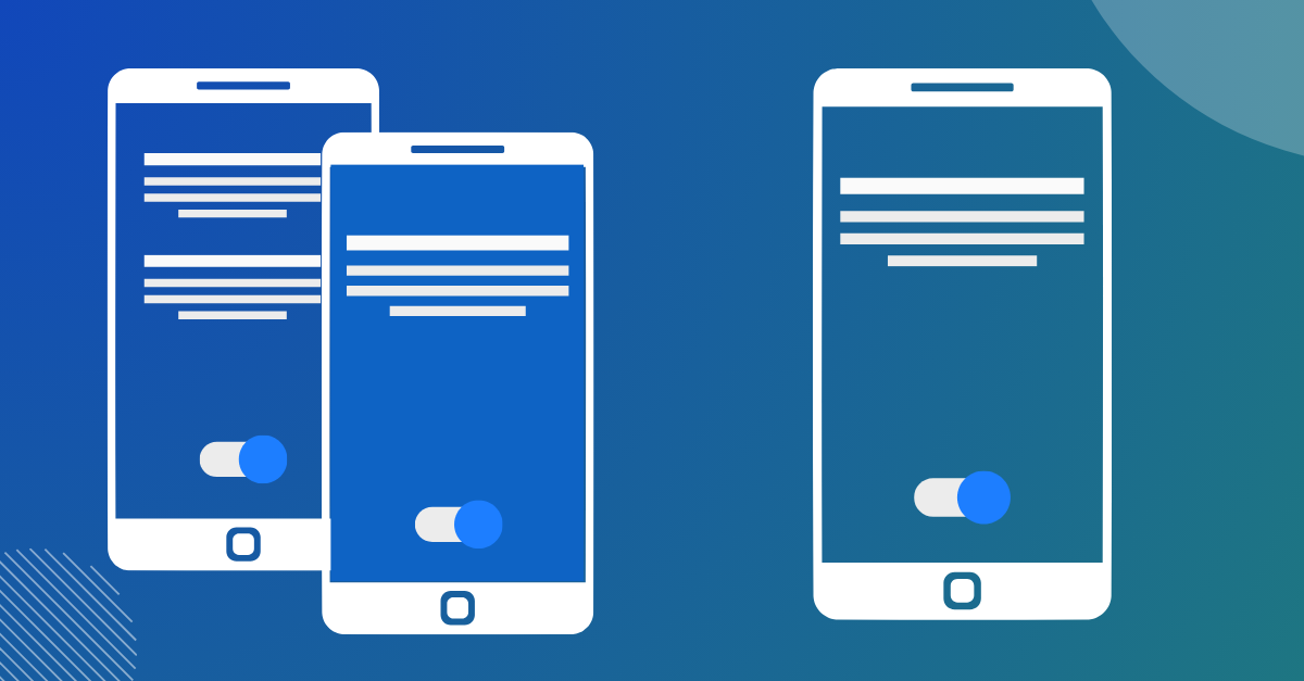
While it might make sense in some cases to shorten flows into single screens, sometimes the product might need multiple screens to communicate information. It depends on your context and use case.
On projects I worked on, it's gone both ways. I've shortened flows from multiple steps and increased the number of screens for scenarios where people need to understand essential information.
The best way to find out is to try different designs for A/B flows with varying numbers of screens to determine what's ideal for your audience.
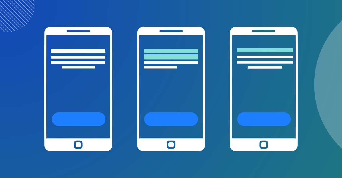
2. Test button placement and visual weight.
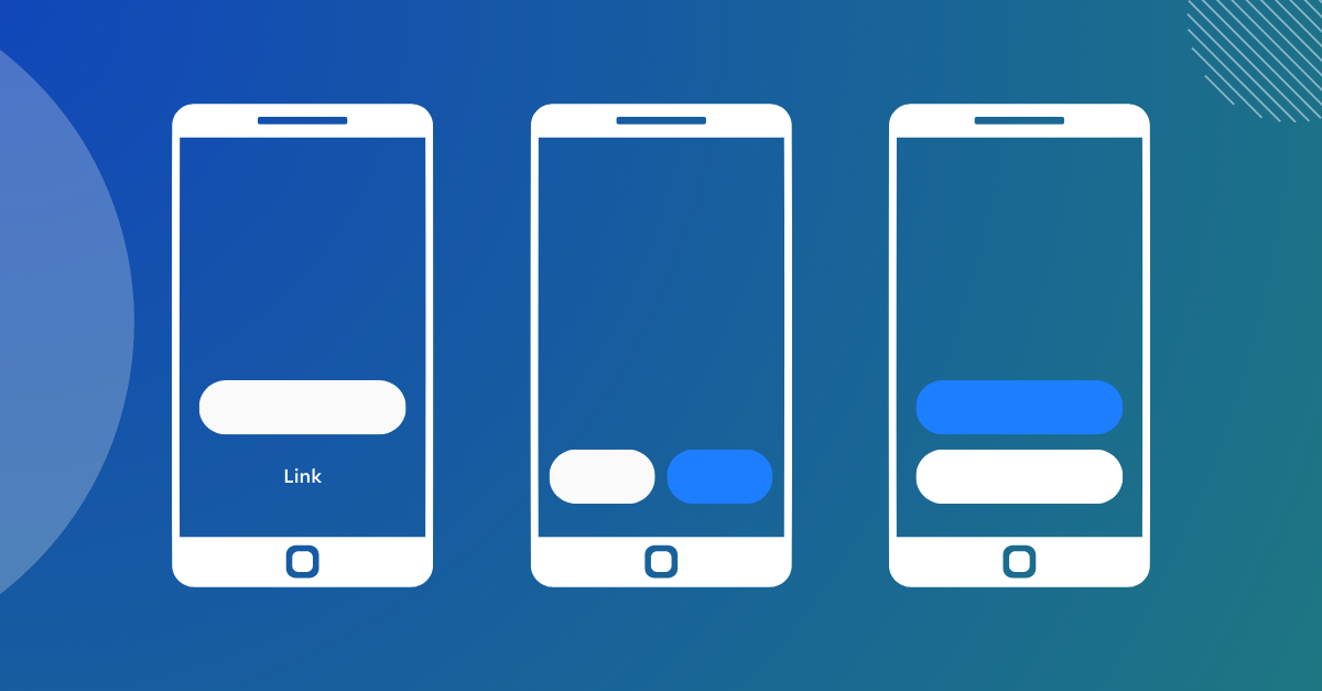
Try using different weights of buttons or links. You can also change the ordering of the buttons if you're trying to drive specific actions, like in a payment flow.
In a project I worked on, changing a secondary button to a link increased our conversions. It created a visual clarity on what the most important action is. But, in some scenarios, the second button might be an equally important choice, and there's no preferred action to take from the user.
Testing is the best way to eliminate uncertainty.
3. Change button colors.
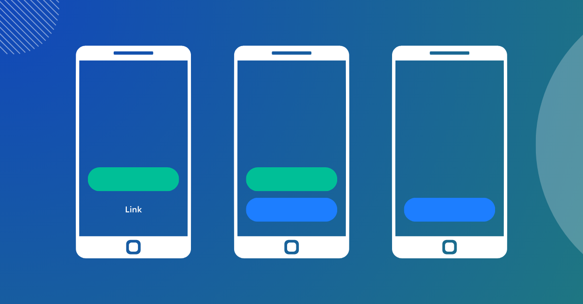
Try running experiments with different calls-to-action colors. Usually, calls to action are blue or green, but depending on your company's brand, that might differ for your use case.
There's a lot of evidence showing how color can impact whether someone clicks on your button.
But, the goal isn't to trick people into tapping a button, the goal is to provide value in the product to encourage people to click. For example, if people are tricked into clicking on something just because it was brightly colored, they might want their money back, or a return. Both of which can lead to a poor user experience.
In fact, this issue is so serious, the FTC has filed a complaint against Amazon for deceptive user interface tricks. So, if you go down this path, make sure your offer or goal is valuable to the user.
4. Test illustrations or images.
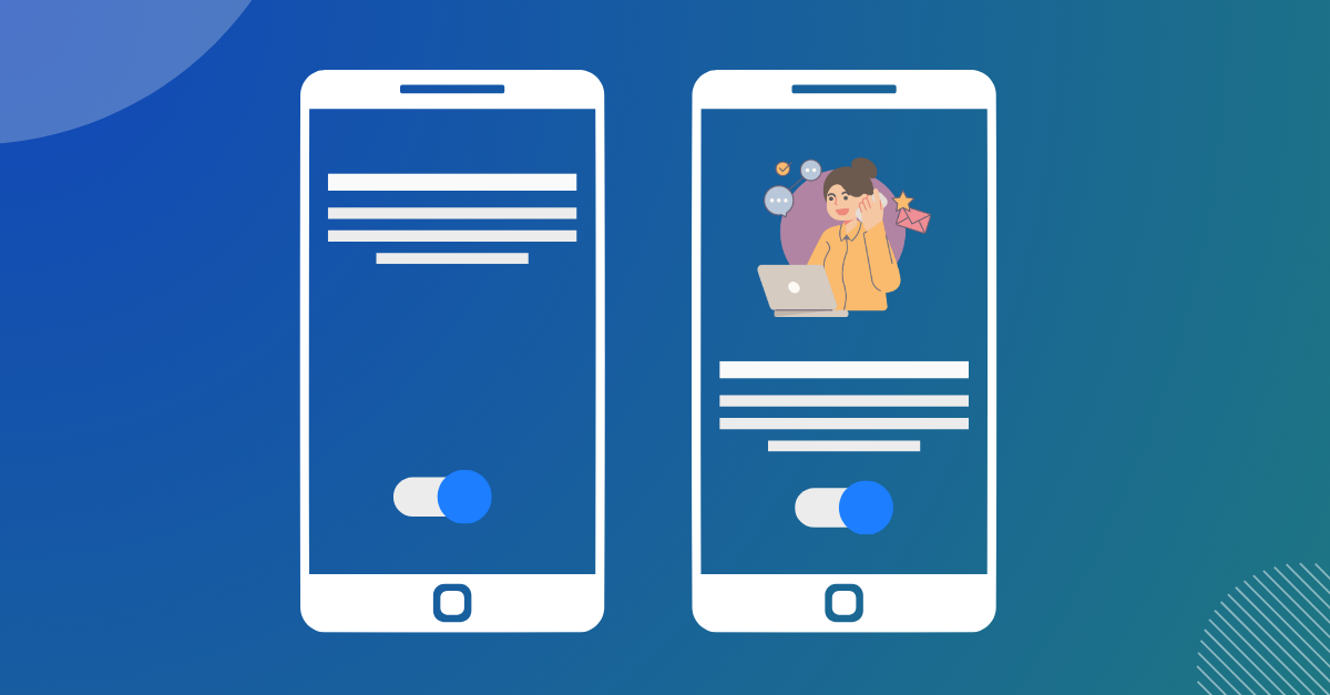
I've seen some extremely good results using illustrations in product flows. In one experiment my team ran, we saw a 7% increase in conversions when using a friendly illustration, vs no illustration.
The reason the illustration worked in our experiment is because it instilled warmth and trust in the experience. Illustrations can depict complex and abstract concepts visually to help communicate to the user what's going on.
You can test designs with an illustration and without to see if there's any difference. Illustrations don't work in every scenario, but it's definitely worth an experiment. If you have multiple illustration types, you can run an A/B test testing between each illustration type.
In the same experience, my team ran a second A/B test to determine if the "type" of illustration would make any impact. The first illustration (Version A) had a brand associated with it, in our case it was Instagram. In the second version (Version B), had an illustration which depicted the action the user would need to take.
Both versions converted higher than the non-illustration version, but the version B depicting the action converted higher. Try A/B testing illustrations for your next test.
5. Test content.
Most marketers know the importance of content and headlines, but I think people underestimate the importance of content in the tech space.
Experiment with headlines, concepts, and visual elements like icons to underscore other concepts. I've seen significant increases in metrics by modifying the content, not just the headlines.
Succinct, clear text almost always wins over flowery, elegant sounding text.
📈 A/B testing design
A/B testing your design is a good way of driving metrics in a fairly low-effort way. The key is to iterate and not use more than one variable at a time. These optimizations work best for areas of your experience that are smaller and easier to break down into components.
How about you?
Are there any good design A/B tests you've tried recently or anything I missed that you'd like to share?